Choosing an exterior paint color isn’t a trivial decision, it shapes how your home presents itself to the street, affects curb appeal, and sets the tone for everything from landscaping to trim details. When homeowners ask “what color should I paint my house?” the white house exterior remains the most enduring reference point. Whether you’re drawn to the crisp simplicity of pure white, the warmth of cream tones, or ready to explore modern alternatives, understanding the psychology and practicality of exterior color schemes matters. This guide walks through proven palettes, the reasoning behind them, and how to pick the right one for your specific home and neighborhood.
Table of Contents
ToggleKey Takeaways
- White house exterior colors remain timeless and versatile, but modern alternatives like soft grays and pale greens now offer equally durable and stylish options.
- Test large paint samples (at least 2–3 feet) on each side of your home at different times of day before committing, as lighting conditions dramatically affect how colors appear.
- Invest in premium acrylic latex paint ($40–$65 per gallon) for superior color retention and 7–10 year durability, which saves money compared to budget paint that fades in 3–5 years.
- Evaluate your roof, hardscape, and neighborhood context before selecting an exterior color scheme, as harmony with existing elements ensures a cohesive and intentional look.
- Proper surface preparation and application technique—two thin coats in shade at optimal temperatures—are critical to paint success and prevent costly repainting mistakes.
- Neutral palettes maintain stronger resale value, while bold colors express personality but may narrow your future buyer appeal if you plan to sell within 5–10 years.
The History of White House Exterior Painting
The white house exterior became iconic for practical reasons before it became fashionable. In the early American period, lime-based whitewash was cheap, readily available, and effectively protected wood from rot and weathering. It reflected sunlight (lowering cooling costs in warm climates) and was easy to re-coat annually. The tradition gained symbolic weight when the President’s House was completed in 1800, its white exterior became shorthand for transparency and democratic ideals.
But white dominance didn’t stick everywhere. Colonial-era homes often featured bold colors, ochre, rust, deep greens, and even blacks, depending on what pigments were available and affordable in their region. As mass-produced paint became standard in the mid-20th century, white emerged as the “safe” choice, particularly in suburban developments where uniformity was valued.
Today, the white house exterior persists because it works: it’s timeless, pairs with nearly any trim color or architectural style, and holds resale value. But, modern exterior paint chemistry and color options have expanded dramatically. Premium acrylic latex paints now hold color and withstand UV exposure far better than their predecessors, making bold and nuanced palettes genuinely durable choices.
Classic White and Cream Color Combinations
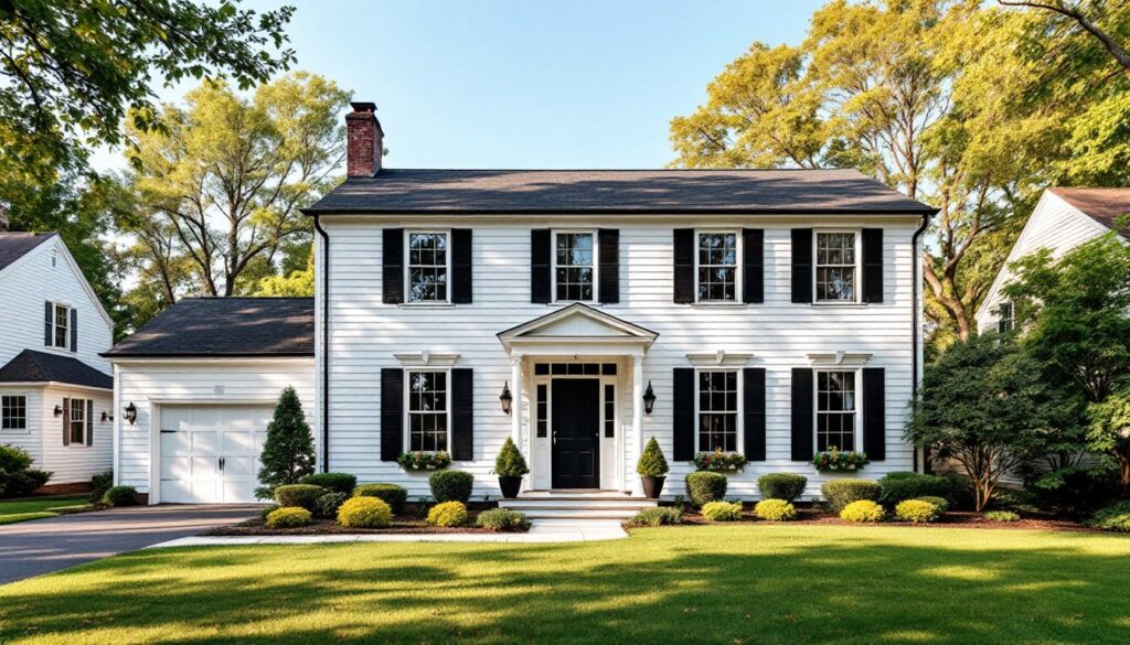
Pure White with Black Accents
This pairing, bright white siding with black shutters, doors, or trim, creates maximum visual contrast and architectural clarity. It works especially well on colonial, farmhouse, and contemporary homes where clean lines matter. The high contrast draws the eye to architectural features: a black front door anchors the entryway, black shutters emphasize window placement, and black roof eaves define the roofline.
When executing this scheme, choose a true white rather than off-white or cream. Look for paint labeled “Bright White,” “Pure White,” or “Navajo White” depending on the brand, avoid anything labeled “cream” or “ivory” if you’re after genuine contrast. Black accents should match or complement your roof color and exterior hardware. One caveat: pure white reflects intense sunlight and can feel glaring in very bright climates: if you notice eye strain when viewing your home at midday, consider a slightly softer white or switch the accent color to dark navy or charcoal.
Warm Cream and Taupe Pairings
Warm creams and taupes offer the white-house aesthetic with softness and visual warmth. These palettes work beautifully on colonial revivals, farmhouses, and transitional homes. The logic here is subtle: cream reads as white from a distance but feels less institutional up close, while taupe, a gray-brown hybrid, provides sophisticated contrast without the harshness of black.
Paint manufacturers offer dozens of warm whites and cream tones. Ask for samples labeled “Accessible Beige,” “Creamy,” “Oyster Shell,” or “Soft White”, and always view them on your actual siding in full sun and shade before committing. Taupe trim or a taupe roof works especially well in regions where the landscape is naturally muted (evergreen forests, prairie grasses, or rocky terrain). The effect is cohesive and grounded, not stark. This combination also forgives a bit of weather-related color shift over time, making it lower-maintenance than pure white.
Modern Alternatives to Traditional White
Contemporary home design has cracked open the white-house monolith. Soft grays, warm taupes, muted sage greens, and even pale blues now dominate modern exteriors. These aren’t radical departures, they’re white-adjacent, but they read as deliberate and current.
Soft gray exteriors pair beautifully with white or pale trim and suit modern farmhouse, mid-century modern, and minimalist homes. Gray doesn’t show dirt or weathering as quickly as white, reducing maintenance frequency. Pale greens and blues reference nature and perform well in wooded or coastal settings where they harmonize with the surrounding landscape. A design reference guide from showing how leading designers use non-white palettes on residential projects.
The key to using non-white alternatives is commitment and research. Light gray works on a ranch home but can feel cold on a colonial without the right trim. Pale sage green complements certain architectural styles but clashes with others. Test large sample boards, at least 2 feet square, and view them from across the street at different times of day. The goal is color that feels intentional, not washed-out or mismatched. Remember: repainting an entire exterior is a significant expense, so overcommit to the planning phase.
How to Choose the Right Exterior Color for Your Home
Picking the right color isn’t just about preference: it’s about fit. Start with these practical steps:
1. Survey your neighborhood. Note the dominant siding colors, trim colors, and roof types on nearby homes. This isn’t about matching, it’s about understanding the context. A very bold color stands out positively in a diverse neighborhood but may feel out of place in a uniform subdivision. Conversely, a subtle palette might get lost on a tree-lined street with lots of natural shadow.
2. Evaluate your roof and hardscape. Roof color, driveway material, and landscaping constrain or support your choice. A warm cream siding clashes with a cool gray roof: a soft gray exterior fights with warm tan brick steps. Take a photo of your home and overlay color samples digitally (many paint retailers offer apps for this). The goal is harmony, not isolation.
3. Test extensively. Buy sample quarts and apply them to 3-foot-by-3-foot sections on each side of your home (north, south, east, west). Paint swatches don’t account for light direction and intensity. View your test panels at dawn, midday, and dusk for several days. Pay attention to how the color changes under cloud cover versus direct sun. This step saves thousands in repainting regrets.
4. Check maintenance implications. White and light colors show dirt and dust more obviously than mid-tones. If you’re in an arid climate or near a dirt road, a light gray or warm taupe hides weathering better. Darker colors absorb heat: in hot climates, they increase cooling costs slightly, usually $20–$40 monthly in summer, but it adds up.
5. Consider resale. Neutral palettes (whites, soft grays, warm creams) maintain broader buyer appeal than bold colors. If you plan to sell in 5–10 years, stick with proven combinations. Bold yellows, deep purples, and neon brights express personality but narrow your future buyer pool.
6. Plan for trim contrast. Your exterior paint scheme includes siding, trim, doors, and shutters. This Old House’s renovation guides detail how trim color contrast affects perceived architectural style. Decide whether trim should match siding (monochromatic, contemporary feel) or contrast sharply (traditional, defined look). Contrasting trim draws the eye upward and outward, emphasizing the home’s proportions.
Material and Paint Quality Matter
Once you’ve chosen a color, invest in quality paint. Premium exterior acrylic latex paint (typically $40–$65 per gallon) holds color, adheres better, and resists mildew far longer than budget options. Cheap paint fades in 3–5 years: premium paint lasts 7–10 years before a refresh. Over a 20-year period, paying extra upfront is economical.
Prepare surfaces properly: power wash, scrape loose paint, caulk gaps, and prime any bare wood or patched areas. Most exterior paint failures stem from poor surface prep, not the paint itself. Use 100% acrylic latex primer on raw wood and stained surfaces: skip primer only on previously painted surfaces in good condition.
Application matters too. Two thin coats beat one thick coat, thin coats cure evenly and resist cracking. Brush the first 6 inches around windows and doors, then roll the flat siding for uniform coverage. Paint in shade and avoid temperatures below 50°F or above 85°F: outside this range, paint won’t cure properly. A common DIY mistake: painting in direct sun causes brush marks and uneven color. Early morning or late afternoon work yields the best results.
Modern design trends from Decoist show movement toward understated, nature-inspired palettes. The takeaway: white exterior paint will always be relevant, but it’s now one option among many proven, timeless choices. Pick what suits your home’s bones, your neighborhood, and your personal style, then commit to quality materials and proper execution.
Conclusion
The white house exterior endures because it works, but “white” today encompasses far more nuance than it did a generation ago. Whether you lean toward classic combinations, explore modern alternatives, or blend approaches, the success of your choice depends on research, testing, and quality execution. Invest time in sampling colors, reviewing the architectural context, and preparing surfaces. A thoughtfully chosen exterior color and properly applied paint will serve your home well for years, enhancing curb appeal and protecting your investment.